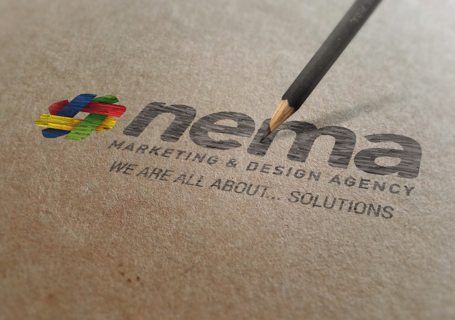

The NEMA logo serves as the cornerstone of our company's visual identity. It is the first impression and symbol that encapsulates the essence of our brand. For a graphic design agency, the evolution of our logo is not just a matter of aesthetic preference, it is a reflection of our journey, growth, and adaptability within the ever-evolving landscape of design trends and technologies.

INCEPTION: It’s said that inspiration can be found in the most unexpected places. The original concept of the NEMA logo was a 2D clean line logo using the primary colors for the print industry (CMYK) and a style influenced by the architectural background of a founder. Colors, forms, and shapes were placed in a harmonious grid line to represent the versatility of design, yet structured and compliant. Drawing from this inspiration, our logo was rooted in architectural principles and offered a unique opportunity to blend artistry with functionality.
Essentially, over the years, we needed to rethink our approach to logo design. We deconstructed the existing logo concepts and identified elements that lend themselves to three-dimensional interpretation. We considered how geometric shapes can be extruded, rotated, and stacked to create layers of depth and dimensionality. We embraced the addition of 3D-looking design to explore new perspectives and angles, breathing life into our logo design.
DIMENSION: In 2001, the 3D infusion of the original logo was to show the depth of our company, and to complement in layers our discipline to design, yet still conserving the architectural feel. Embracing the possibilities of 3D design, we embarked on a journey to reimagine the logo, infusing it with depth, dimension, and dynamism. The result? A striking transformation that retained the essence of the original while heralding a new era of innovation and versatility.
Today, the NEMA logo stands as a testament to the transformative power of design. What began as a 2D clean line inspired by architectural lines, evolved into a dynamic masterpiece that not only complements NEMA's design discipline, but embodies its ethos of creativity, innovation, and excellence. As the design landscape continues to evolve, one thing remains certain: NEMA will be at the forefront, shaping the future of graphic design one bold idea at a time.